Project Overview
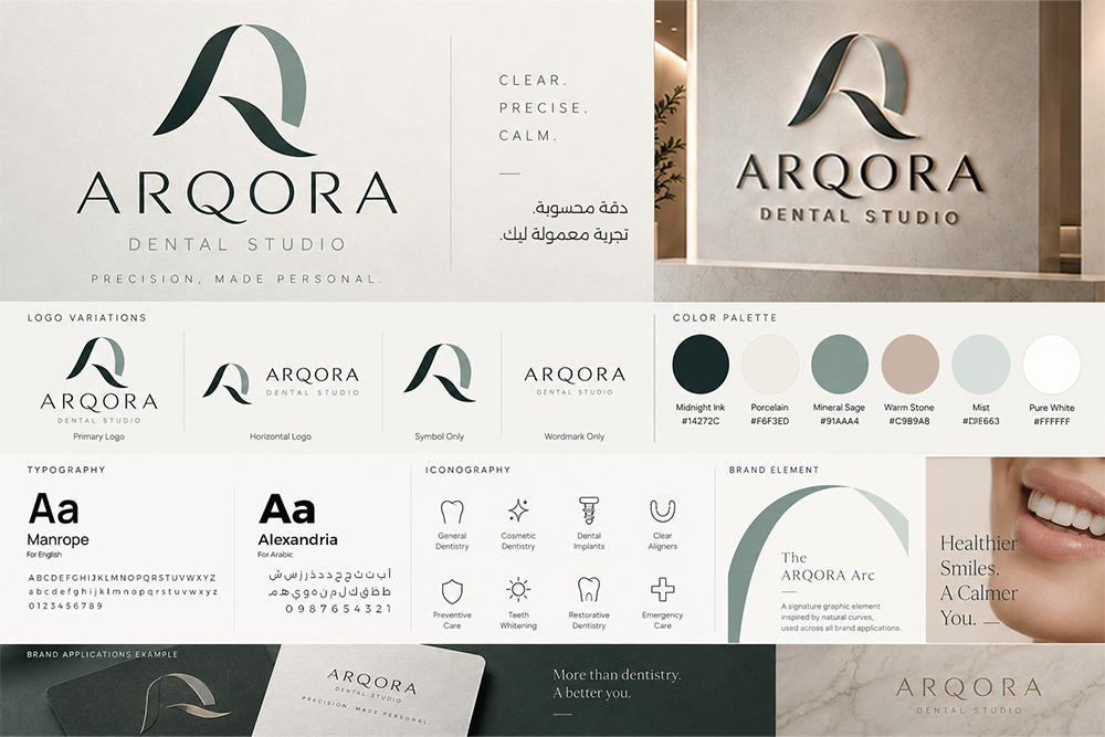
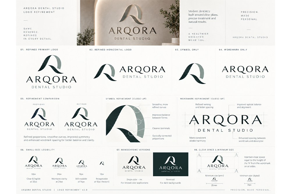
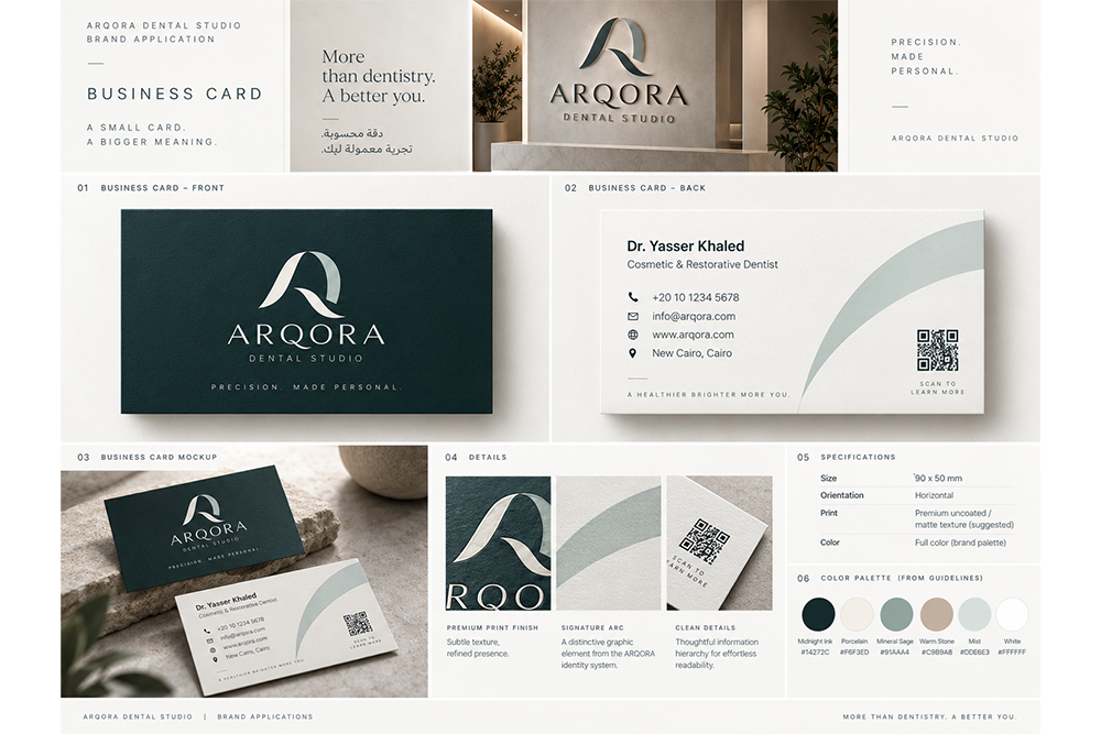
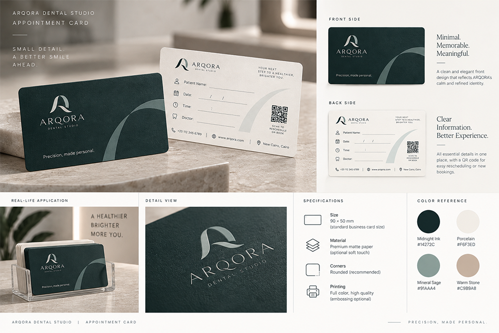
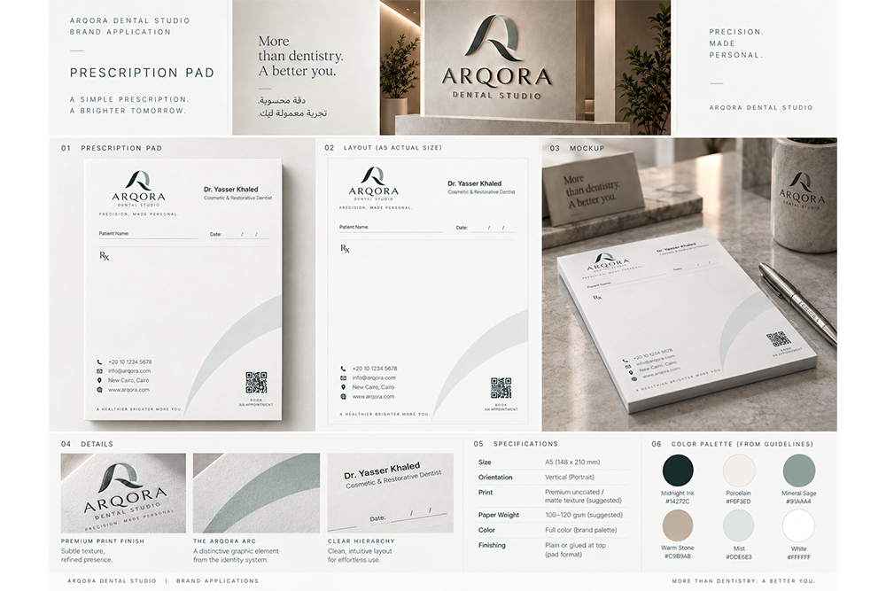
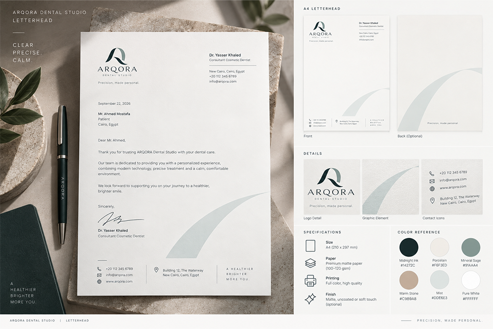
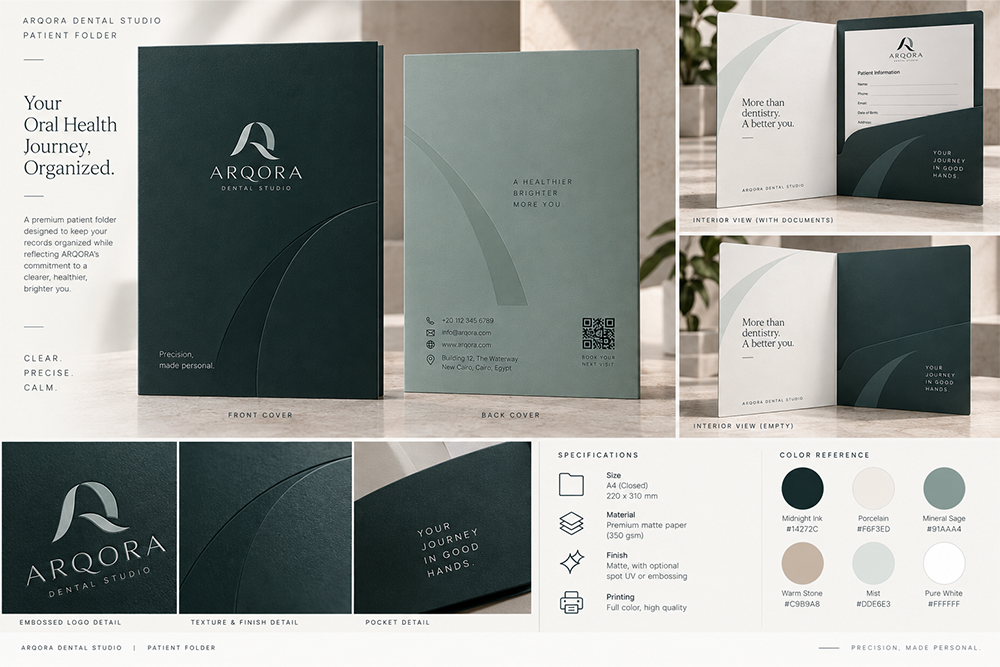
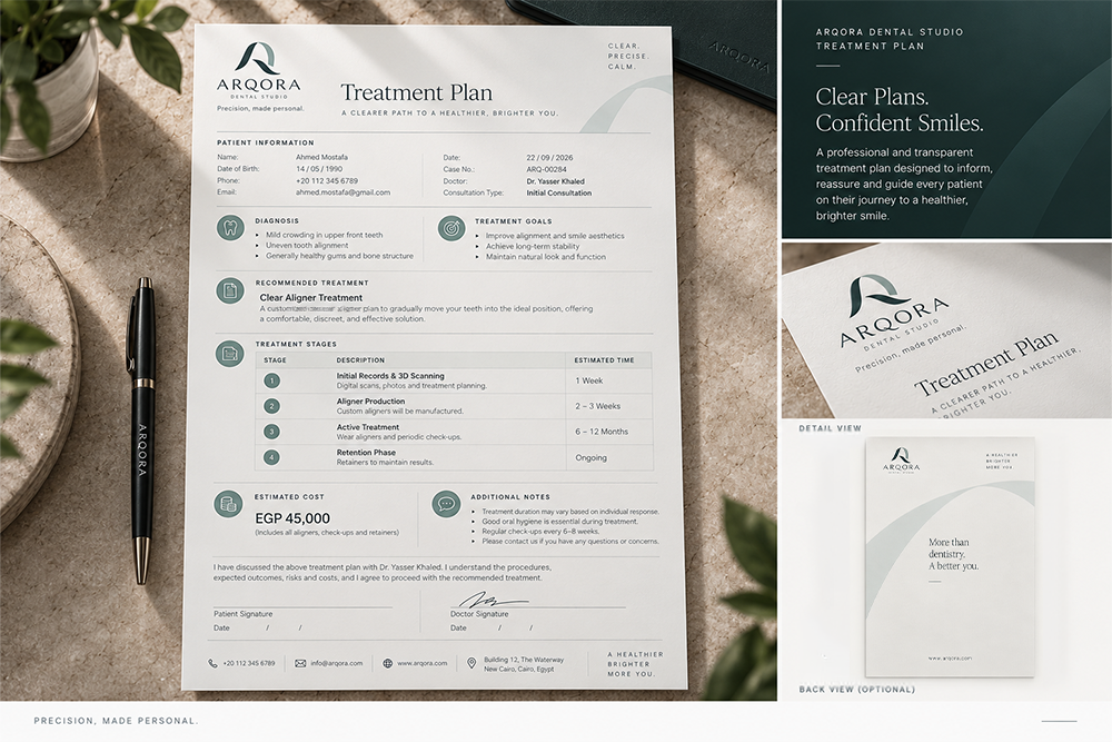
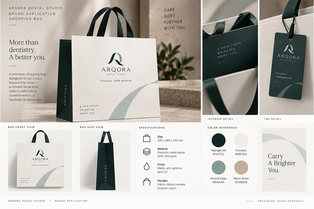
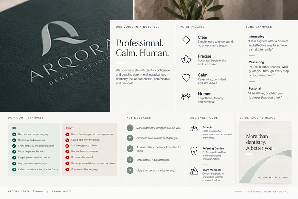
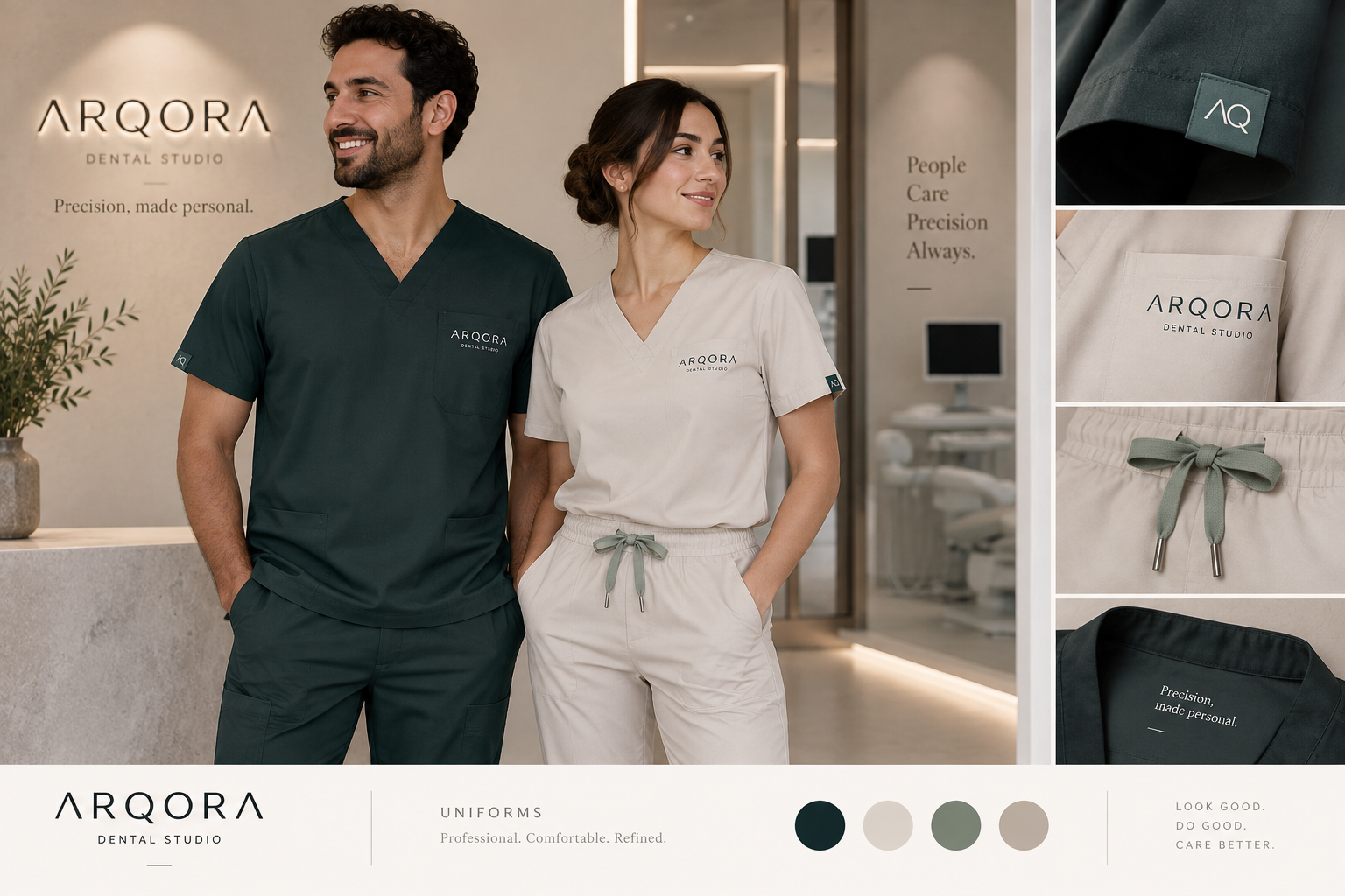
ARQORA Dental Studio needed an identity that moved beyond the familiar visual language of traditional dental clinics. The objective was to create a premium healthcare brand that feels precise, calm, architectural, and highly personal, while maintaining the credibility expected from a professional medical environment. The brand strategy was built around the idea: “Precision, made personal.” This positioning became the foundation for the complete visual identity system. The creative direction combines four key influences: modern architecture, healthcare precision, editorial design, and premium hospitality. A restrained visual language was developed around clean geometry, generous spacing, sophisticated typography, natural materials, and subtle architectural forms. The ARQORA Arc and AQ monogram language became a central graphic device, creating a recognizable system without relying on conventional dental symbols such as tooth icons. The color palette was designed to communicate calm confidence and premium care through Midnight Ink, Porcelain, Mineral Sage, Warm Stone, Mist, and Pure White. The identity system was then extended across both physical and digital applications, ensuring that every patient touchpoint communicated the same level of clarity, precision, and refinement. The result is a distinctive dental brand positioned around natural aesthetics, personalized care, and understated premium design rather than generic clinical imagery.
Technologies Stack
Key Performance Results
- ✦ Established a distinctive premium position for ARQORA within the dental healthcare category.
- ✦ Created a complete visual identity system instead of relying on a standalone logo.
- ✦ Built a recognizable graphic language without conventional dental clichés.
- ✦ Created a scalable identity suitable for digital, print, environmental, and clinic applications.
- ✦ Established clear brand principles around Clear, Precise, Calm.
- ✦ - Built a visual foundation capable of supporting the clinic’s website, social media, signage, patient materials, and future campaigns.