Project Overview
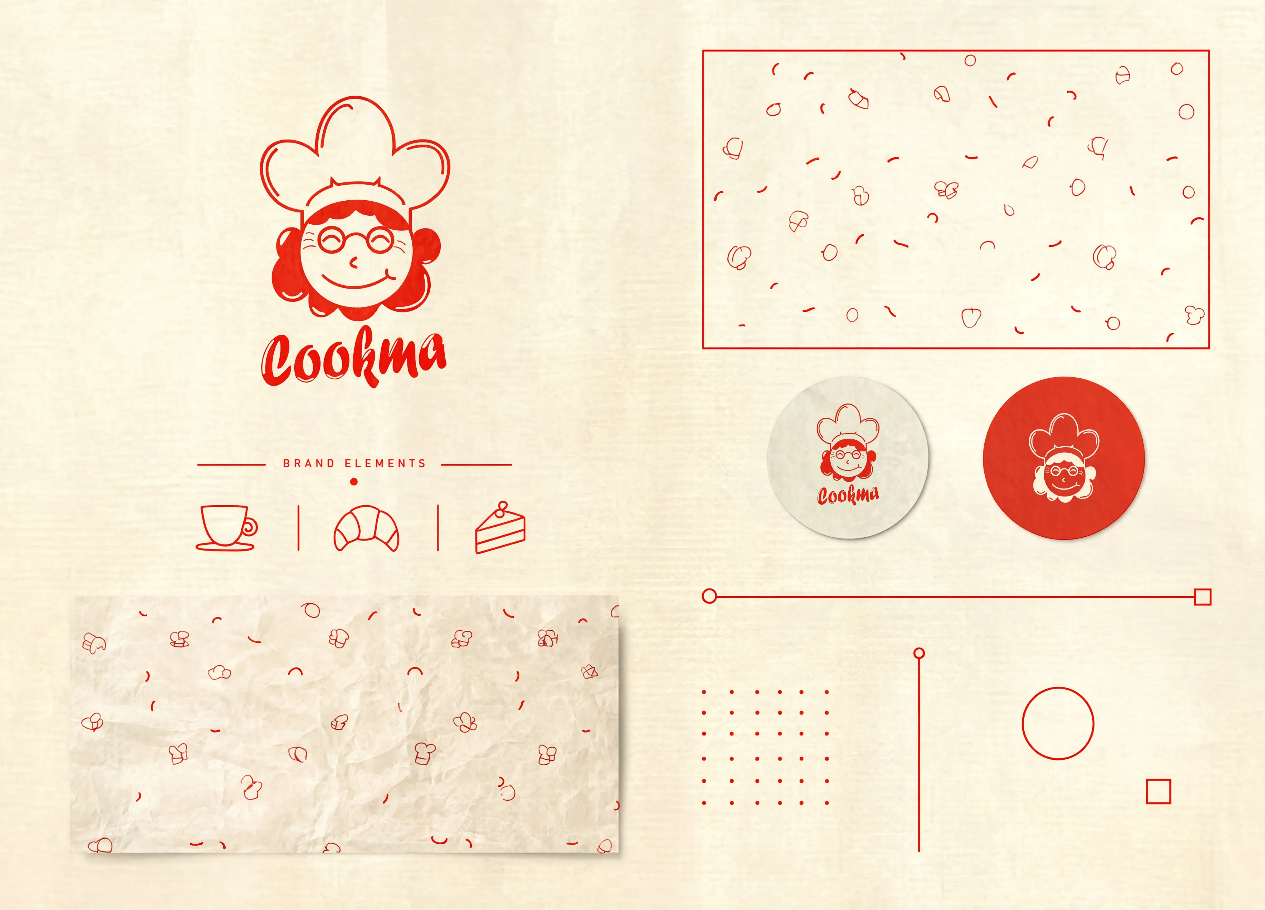
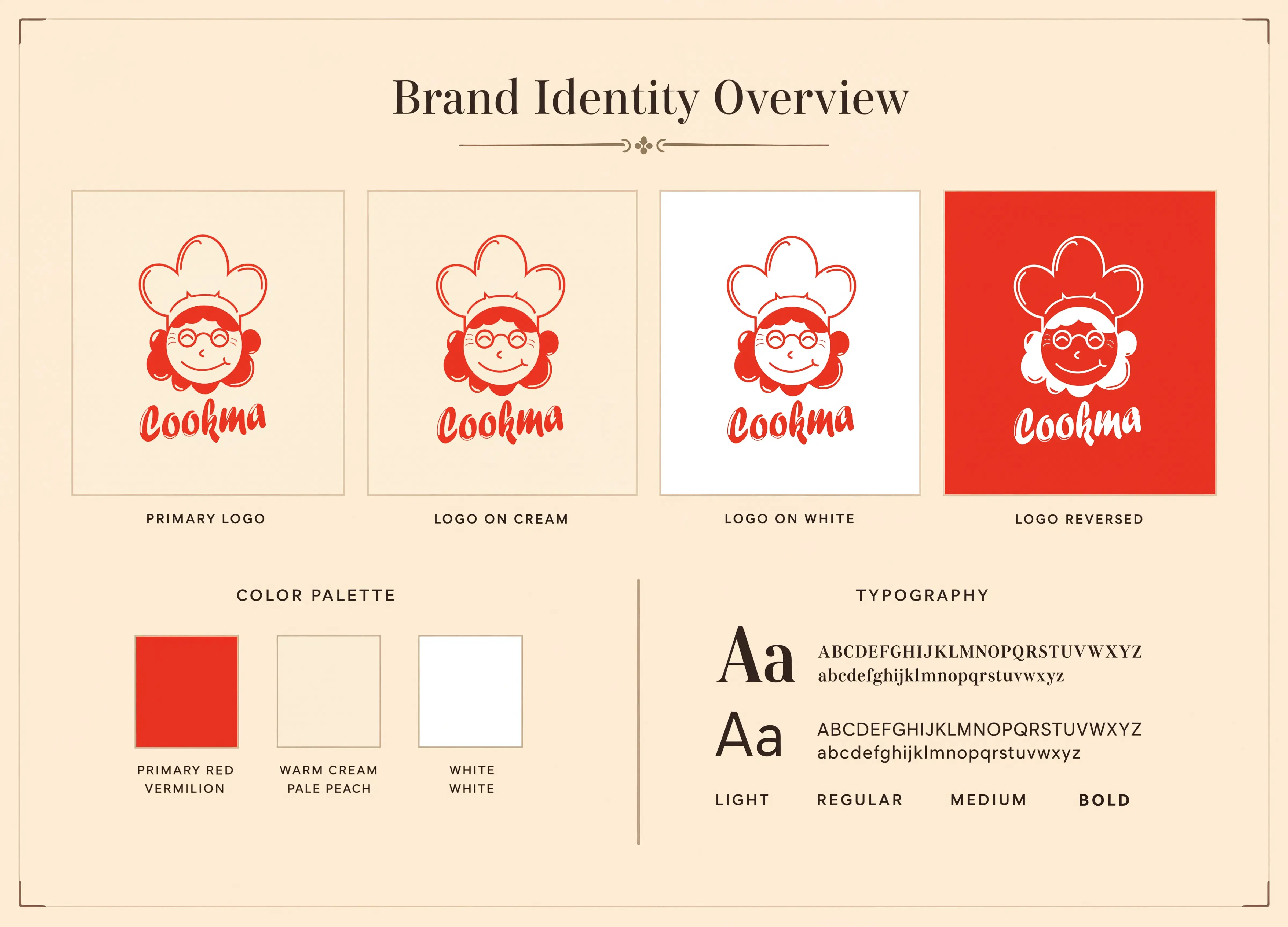
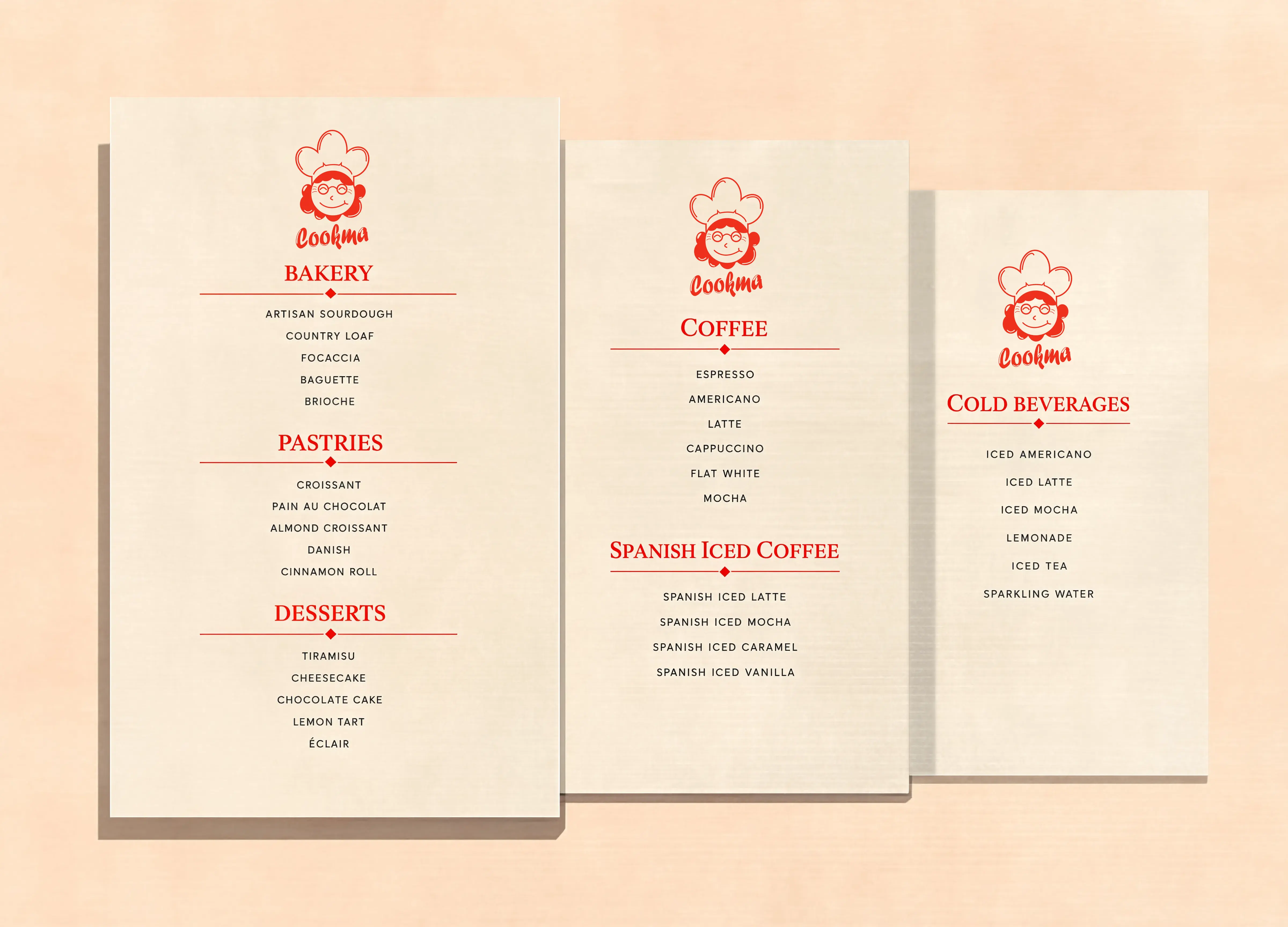
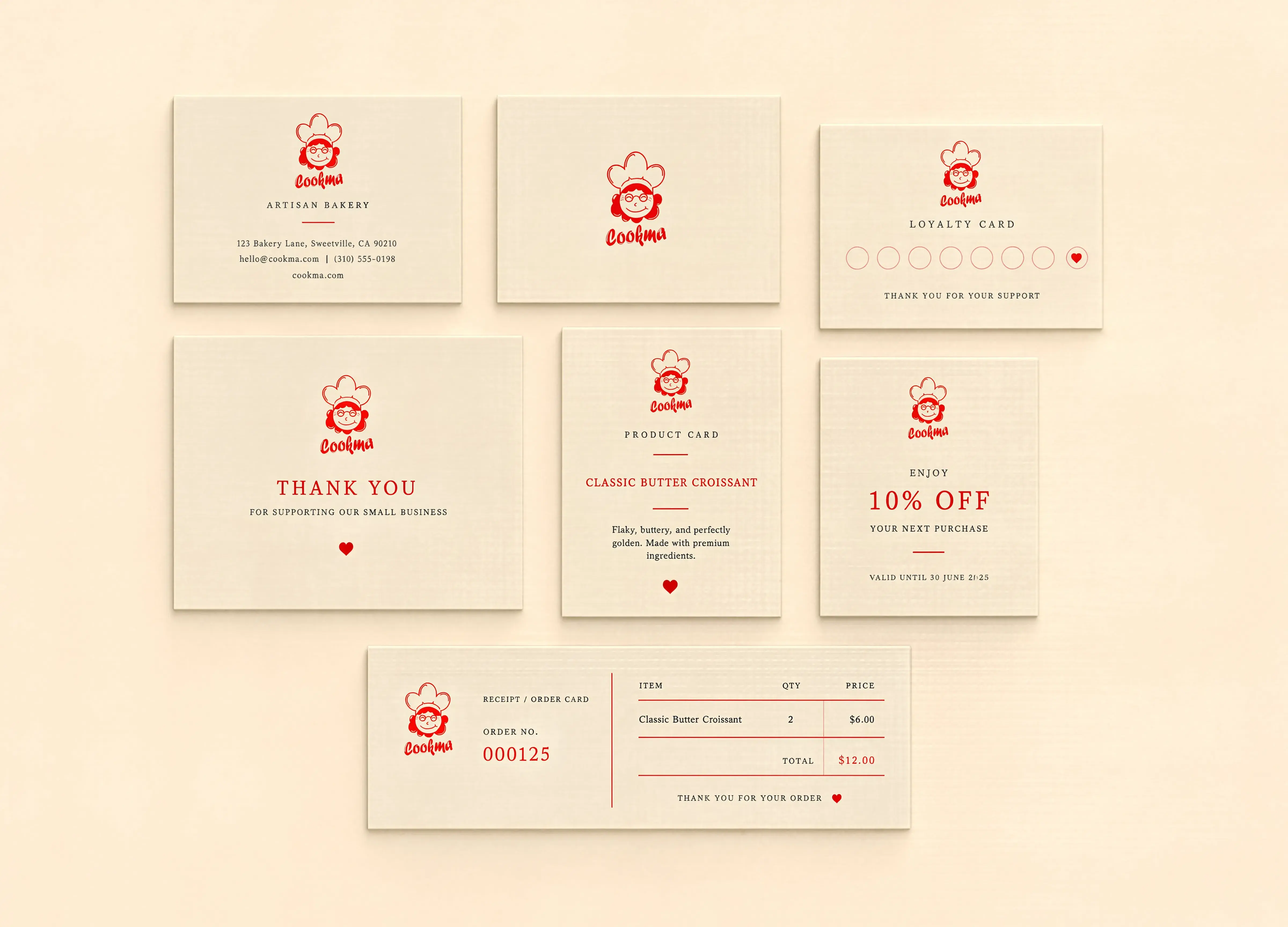
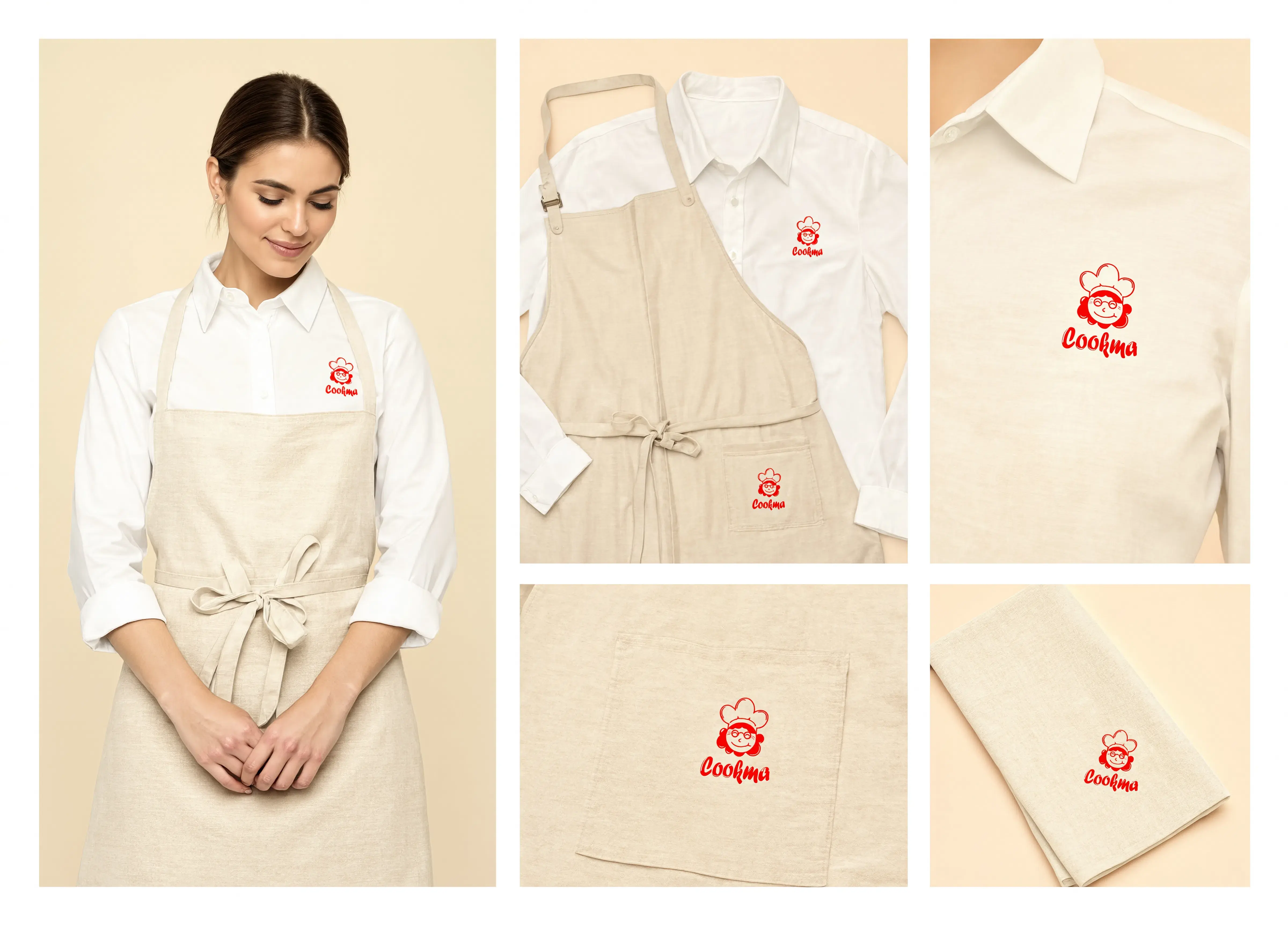
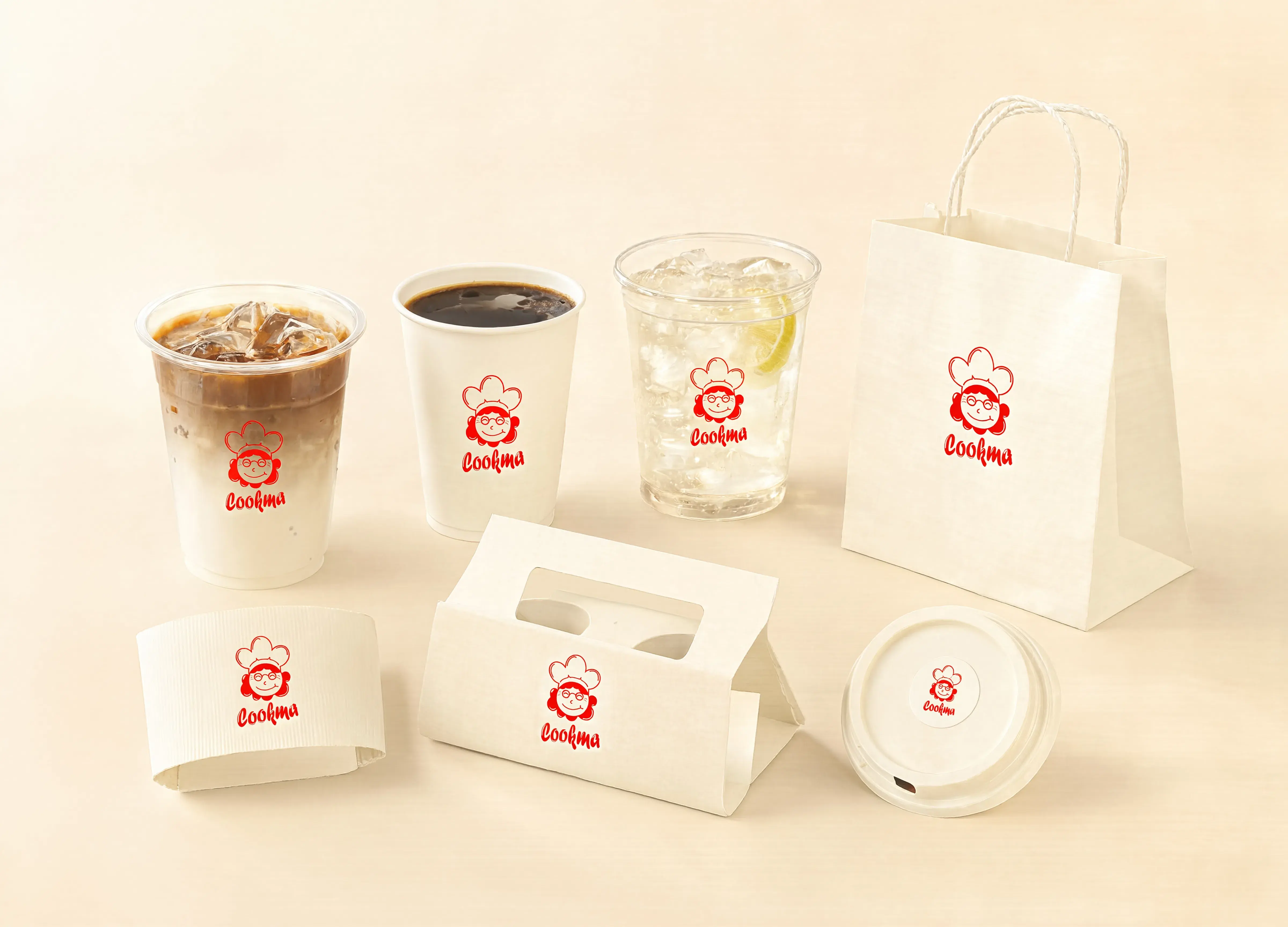
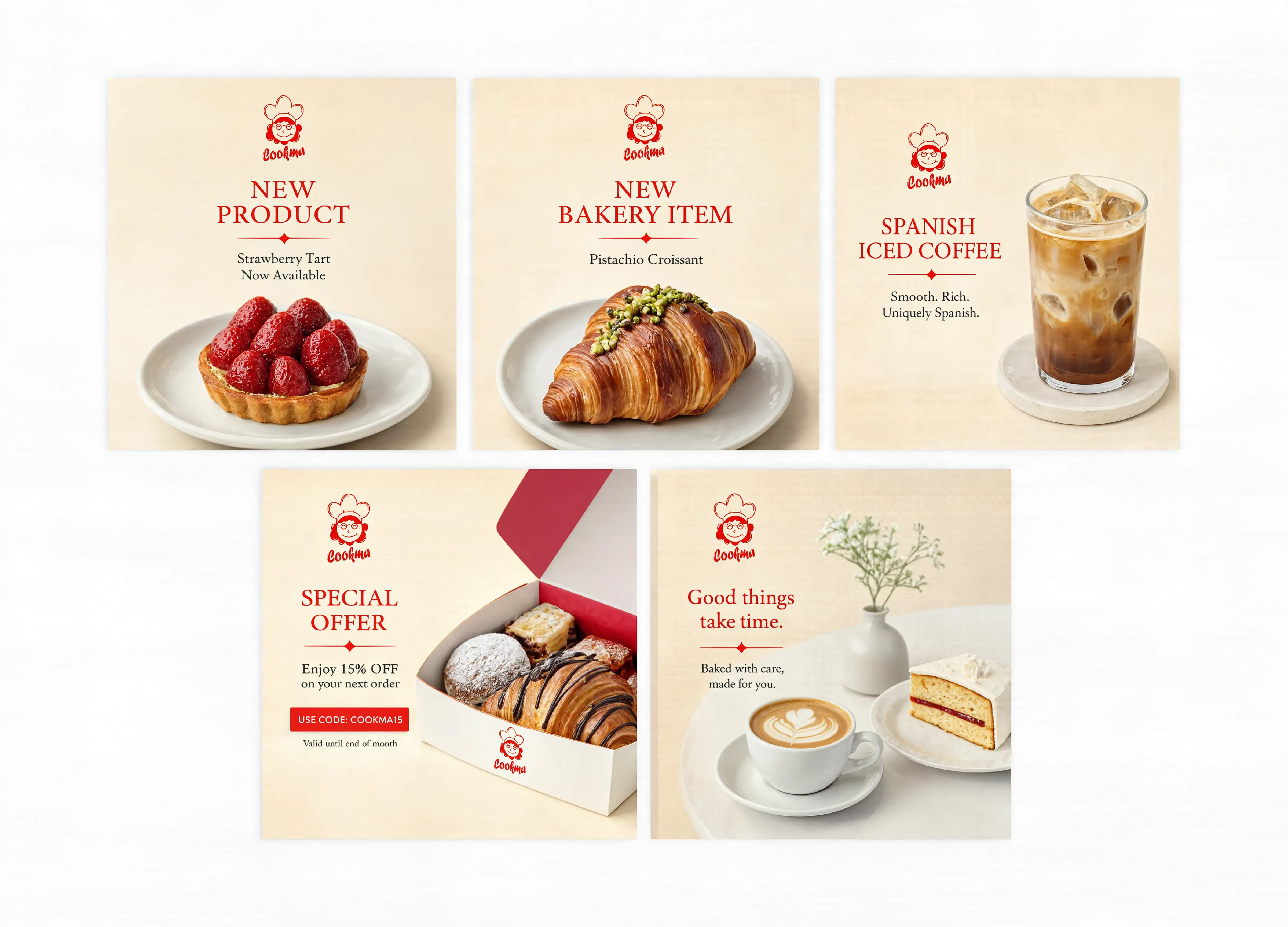
The Cookma branding project focused on creating a complete and consistent brand experience rather than simply designing a logo. The identity was designed to feel friendly and approachable while maintaining the premium character expected from an artisan bakery and specialty coffee brand. The visual system is centered around Cookma’s illustrated chef mascot and expressive wordmark. A warm cream and pale peach base creates a soft handcrafted atmosphere, while vermilion red acts as the main brand accent across packaging, menus, promotional materials, digital interfaces, and social content. The brand system was extended into packaging concepts, coffee cups, bakery boxes, shopping bags, staff uniforms, loyalty cards, product cards, promotional materials, menus, social media content, and digital assets. Typography combines elegant editorial serif headlines with clean sans-serif supporting text, allowing Cookma to balance heritage, craftsmanship, and modern usability. The final identity was also designed specifically to scale into Cookma’s e-commerce ecosystem, ensuring that the physical brand, website, admin dashboard, product photography, and marketing materials all share the same visual language.
Technologies Stack
Key Performance Results
- ✦ Developed a complete and scalable brand identity system.
- ✦ Established a consistent visual language across digital and physical applications.
- ✦ Created a unified packaging and product presentation system.
- ✦ Developed reusable brand assets for social media and promotional campaigns.
- ✦ Extended the brand identity seamlessly into the e-commerce website and admin dashboard.
- ✦ Standardized product photography and promotional artwork for consistent presentation.
- ✦ Built a recognizable visual system suitable for future branches, campaigns, products, and packaging.